Monthly Archives: November 2011

Getting to Christmas

Below is a composite image of notes I made on Saturday evening on how I’m going to be getting to my grandparents for Christmas. Every year for the past nineteen—except last year and also in 2001 or 2002, though I can’t remember which one of those—me and my family have descended upon Bournemouth for the Christmas holiday. This year will be the first in which I’ll have to pass port to get there and, boy: it’s going to be difficult.
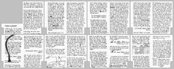
‘Getting to Christmas’ composite scan

As you probably can’t read owing to the deliberately low resolution of the scans, I’m planning on transversing the continent by plane and train. The easiest and most direct route would be to hop on the train to Schiphol, catch a Flybe flight to Southampton and get on a fast service to Bournemouth via Southampton Central. But, whilst shopping at Albert Heijn on Saturday afternoon, I pondered “surely I can fly cheaper with easyJet”—that was a thought I’d rather not have had; it turned my evening to a nightmare of investigation, calculating and reinvestigation. I calculated the costs of flying with easyJet into three of London’s airports, but it wasn’t until I was very near the end of my tether that I discovered which one had the upper hand.

One of the main problems is the method of payment. I’m not in possession of a credit card in the Netherlands and my Dutch Maestro card is… well, it’s not a real Maestro card—there’s no bloody card number. I know there is a card number—various receipts have allowed me to determine its last seven digits—but, alas, it’s not …public (if you like) and I’m unable to use it to purchase things from our good friend the Internet. Except in the Netherlands where we use a bank authentication system but that’s nothing to do with the card provider. As such, I’m having to transfer money back to my British account in order to pay for my flight; which is a bit of a pain-in-the-arse.
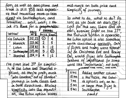
Pages 15 and 16

Pages 15 and 16 include a 'cost vs simplicity' table. The circled number ones represent the least costly (column III) and least faffy (column IV) journeys. It's not the prettiest of Moleskine pages but please understand: I was very, very tired and it was close to 01:00... and the table addition on page 16 was drawn/written on Sunday morning, hence its relative neatness.

My findings are that the cheaper options are less direct that the more expensive, as you would expect. I could compromise on saving money and fly into Luton: a train into London and then another train out of London makes that part of the journey relatively painless but it costs a little more, both in the rail fare and time. The Gatwick option is the cheapest—£70 cheaper than flying direct to Southampton—but it would be a job to get onto the correct line out of London for Bournemouth. But, surprisingly, it takes only an hour longer to fly into Gatwick and sachet my way over to the South Western Main Line than it does to fly Flybe to Southampton and then walk the reported “sixty seconds” between the terminal and Southampton Airport Parkway. Gatwick might not be a bad choice after all.

And just so you know, it’s a Stabilo Bionic Worker I use.
Tagged

Transport Map

I haven’t blogged about OpenStreetMap recently. Since moving to the Netherlands, my contributions to the project have slowed right down and since the import of AND data in 2007 (which “finished off” 99% of the Netherlands), I seem to have lost my motivation for all but “armchair mapping“.

But that doesn’t mean I can’t continue to be a part of the project. The main reason I fell in love with OpenStreetMap wasn’t for its ‘default’ style (called Mapnik), but for what one could do with the data. The project and the maps it produces (or helps to produce) are based around a common tagging scheme. You’re perfectly welcome – encouraged even – to take the data and produce a map that shows only the ways, areas or relations with the tags you specify; and filter out or maybe colour differently other tagged data. Maybe that’s not a very good explanation but the idea is that your map or someone else’s specialist map doesn’t have to show the map features that aren’t relevant to its target audience or to its cause.

Here’s a better example. A new style (also known as a rendering) has recently been added to the “most popular” drop-down on the main OpenStreetMap website. Out of the hundreds of renderings out there on the Internet, only four have received the privilege of becoming featured layers on the OpenStreetMap website. The latest is called Transport Map and, as its name suggests, it highlights public transport routes and stops.

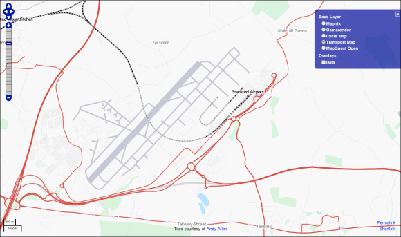
Public transport at London Stansted

The Stansted Airport area seen through Transport Map. Underlying data © OpenStreetMap.org and its contributors, CC BY-SA; tiles courtesy of Andy Allan.

Transport Map, as shown in the image of the Stansted Airport area above, shows quite clearly the area’s bus routes in red; and at high zoom levels, the line numbers of buses are printed along the route. The style also shows rail-based modes of transport as dashed black lines and as grey lines when underground (such as the tunnel under the runway at Stansted). You can also see the blue menu of the ‘promoted’ map styles at the top-left of the map in the screenshot above.

I really like the modern look of this particular style. The previous heavyweight in the public transport style arena was ÖPNV-Karte but I now find that style a little too …bulky. Do you remember when Apple changed the iTunes logo from thin green lines to thick blue ones?; I’m getting that feeling again. One can see a definite difference between the two maps’ designs if one compares them side-by-side.

Transport Map and ÖPNV-Karte

Central Amsterdam on Transport Map (left) and ÖPNV-Karte (right). Map data © OpenStreetMap.org and its contributors; CC BY-SA. Map tiles © their players.

In my opinion, the more recently designed Transport Map (left) is a lot less gunky and easier to read than ÖPNV-Karte (right). I’m a stickler for clean and minimalistic graphic design, and that’s what I think the Transport Map layer offers. It begins to get more convoluted at lower and lower zoom levels but that’s the case with all map styles.

But going back to talking about including or excluding certain tags from one’s custom style(s) for a second. Note how ferries are rendered in different ways in the screenshot of Amsterdam above. There are two ferries which cross the IJ from behind Centraal Station – ÖPNV-Karte renders ferries with relations purple (like the Fast Flying Ferry which heads northeast towards IJmuiden) but not the GVB ferries; Transport Map on the other hand recognises the tag route=ferry on ways as well as relations, since both companies’ ferries appear the same. All very boring stuff, but I hope it’s a good example of how different tags produce different results – there’s still plenty of work for “armchair mappers” like me to get on with.

Lighthouses and f-signs

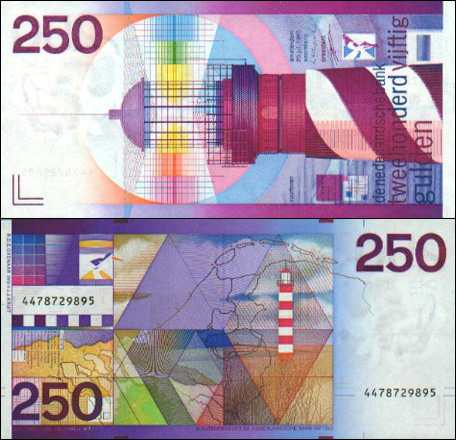
British embassies being advised how best to deal with expats without cash. British banks preparing for a eurozone collapse. You’d think the UK was part of the eurozone, the amount of scare stories it’s been pumping out this past week. A eurozone collapse and subsequent break-up isn’t around the corner — the phrase “Meanwhile in…” is particularly relevant here; the Netherlands isn’t massively worried about the whole thing and it seems that the only government shitting themselves in fear is the British. But — and I’m stressing the word ‘but’ like a Boeing wing undergoing testing — let’s assume that one morning, the Netherlands wakes up and the euro’s ceased to exist overnight. The most plausible plan of action would be to reinstate the currency we had before 2002: the Dutch guilder; a currency with some of the most colourful banknotes I’ve ever seen.

250 guilders (gulden) banknote

A ƒ250 banknote from the 1980s. © De Nederlandsche Bank; scan © http://www.banknotes.com; fair use CDPA 1988 §30.

Tagged

→ Why I’m not going near Spotify

James Allworth:

There’s something pretty insidious buried inside music rental models like [Spotify]. Understanding […] that we consume audio in a fundamentally different way [to the way we consume movies and television] is critical to understanding why, from a consumer point of view, paying a monthly rental fee is a risky way of obtaining music.

Now, I agree with James here – and yes: it’s an article from July – that subscription-based music services effectively lock you in as long as you want to ‘keep’ the music collection you never actually owned in the first place. And also, all that music can’t be good for you.

I do have one major problem with Allworth’s article, however, and that’s the overgeneralisation in the second paragraph that all traffic over the BitTorrent protocol is copyrighted material which should be being shared. Sorry, James, but this isn’t true. BitTorrent and pirating are not synonymous.